Earthquake Disaster Risk Index: What Homebuyers Must Know
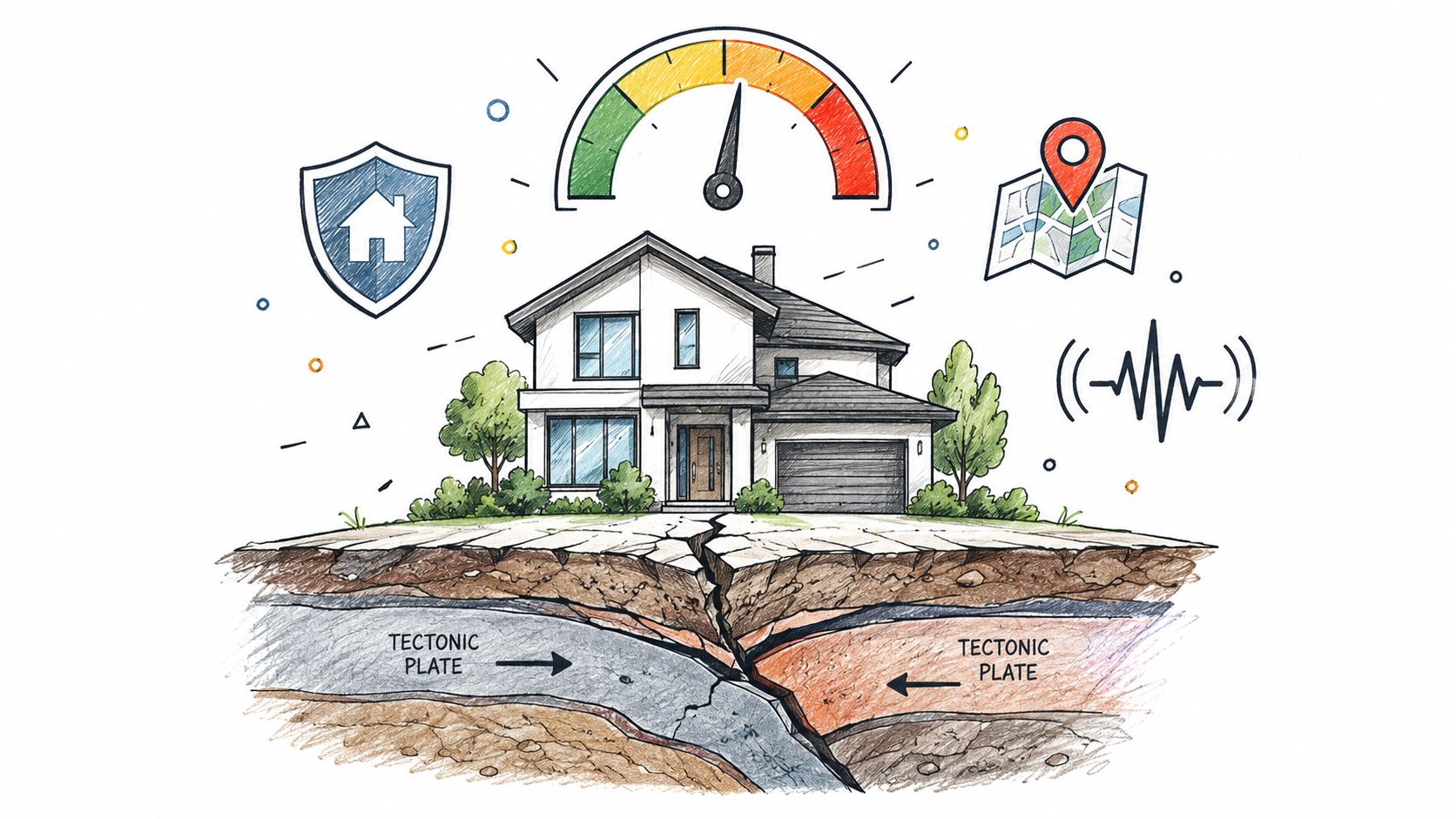
An earthquake disaster risk index combines seismic hazard probability with community vulnerability and resilience to estimate expected annual economic loss. It is not a direct prediction that a specific house will be damaged in a specific year, and that distinction matters if you're choosing between two homes that look similar on a map.
Most buyers first see a single score or letter grade and assume it tells the whole story. It doesn't. The key question is whether the index is measuring ground shaking, who and what is exposed, or the broader loss and recovery picture that affects a move.
Table of Contents
- Understanding the Earthquake Disaster Risk Index
- How FEMA Calculates Earthquake Risk
- USGS Hazard Models vs FEMA Risk Scores
- Why Hazard Maps Alone Mislead Homebuyers
- Real-World Scenario Analysis
- A Practical Screening Framework for Homebuyers
- Hidden Vulnerabilities and Equity Gaps
- Frequently Asked Questions
- Is an earthquake disaster risk index the same thing as an earthquake hazard map?
- What does 2% probability of exceedance in 50 years really mean?
- Why can two homes on the same street have different earthquake risk?
- What should I check before I trust a city's earthquake score?
- Does a lower FEMA score always mean a safer place to live?
- Should renters use the same screening process as buyers?
- How does future growth change earthquake risk?
Understanding the Earthquake Disaster Risk Index
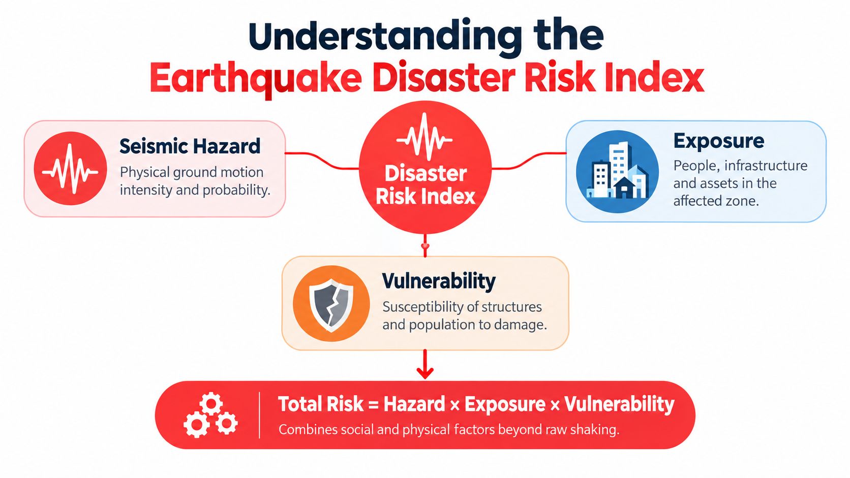
A relocation search can go wrong at the first map click, because a risk score can look precise while hiding what it measures. An earthquake disaster risk index combines seismic hazard, exposure, and vulnerability, so two homes in the same city can carry very different profiles even when the hazard layer looks similar.
Hazard is the shaking, not the whole outcome
USGS probabilistic seismic-hazard models estimate the chance that ground motion will exceed a threshold over a defined period, often using peak ground acceleration and the 2% probability of exceedance in 50 years framework. The 2023 National Seismic Hazard Model incorporates earthquake-source activity, fault-slip rates, crustal deformation, earthquake frequency, and ground-motion relationships, then supports building-code, insurance, and risk applications. USGS National Seismic Hazard Model
That makes the model a measure of probabilistic shaking hazard, not a forecast of when an earthquake will strike or how much damage one property will take.
Risk rises when exposure and vulnerability rise
Two houses can sit on the same street and still face different outcomes. One may rest on softer soils, another in a basin, and another in a structure that performs poorly under shaking. A city-level score misses those differences if it relies only on distance to a fault or past earthquake counts.
A technically sound screen looks for probability-weighted shaking metrics, then checks for local amplification, liquefaction susceptibility, and site geology. USGS notes that local hazard can exceed regional map values where geology amplifies shaking. USGS Hazards overview
For a homebuyer, that means the hazard layer answers where shaking is likely, not what happens to your street when it arrives.
How FEMA Calculates Earthquake Risk
A home can sit in a moderate shaking zone and still show a high FEMA risk score if the expected losses are concentrated in fragile buildings or harder-to-recover communities. FEMA's National Risk Index is designed to capture that second layer. It starts with hazard, then adds exposure, vulnerability, and resilience so the result reflects potential loss, not shaking alone. FEMA National Risk Index primer
Expected Annual Loss is the anchor metric
FEMA's core earthquake measure is Expected Annual Loss (EAL), the average annual dollar loss to buildings, population, and agriculture. Its calculation combines exposure, annualized hazard frequency, and historic loss, so the score reflects what is at risk and how often damaging events are expected to occur. FEMA National Risk Index primer
For earthquake-specific estimates, FEMA relies on the P-366 Estimated Annualized Earthquake Losses for the United States study, which uses Hazus to estimate building damage, casualties, and economic losses at Census-tract and county levels. The output is expressed in dollars of average annual loss, which makes it useful for comparing places, but it still needs context before you use it for a house hunt. A tract with modest annual loss can still contain one highly vulnerable property that deserves a closer inspection than the average suggests. FEMA National Risk Index data and update documentation
Social conditions change the same shaking event
FEMA also incorporates social vulnerability and community resilience because identical physical shaking can produce different consequences across communities. A place with similar ground motion can still face very different disruption if residents have fewer resources, weaker insurance access, or slower recovery capacity.
For relocation analysis, that means EAL is useful as an economic benchmark, but it should not be read alone. The cleaner interpretation is causal. Hazard drives physical intensity, exposure determines what is in harm's way, vulnerability shapes who gets hit harder, and resilience affects how fast a place can recover.
A low-population rural area can show small aggregate losses and still be a poor fit if the buildings are fragile or if recovery services are thin.
USGS Hazard Models vs FEMA Risk Scores
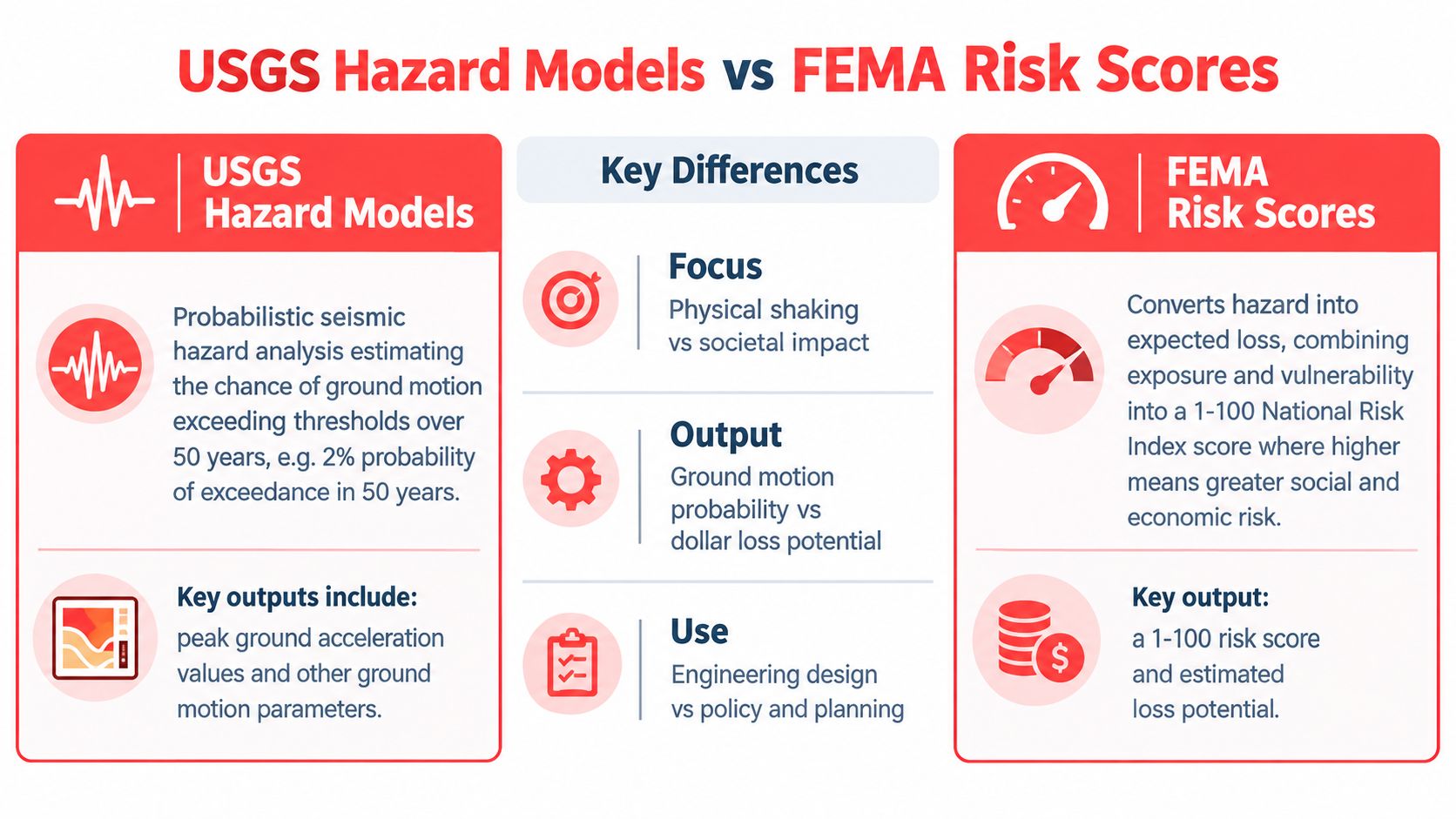
A buyer can look at two homes on the same block and still face two very different earthquake outcomes. That is because USGS and FEMA answer different questions. USGS describes what shaking a place may experience, while FEMA translates hazard into expected community loss after exposure and vulnerability are considered. USGS hazard maps FEMA National Risk Index data and update documentation
Different questions, different outputs
USGS hazard maps use explicit probability thresholds, often showing peak horizontal ground acceleration and spectral response acceleration with 10% and 2% probability of exceedance in 50 years for the contiguous United States. The 2%-in-50-years measure is often used in stricter design and hazard comparisons because it shows the chance that a mapped shaking level will be exceeded during a 50-year period. USGS hazard maps
FEMA's risk score starts with hazard, then adjusts for expected loss and community conditions. That difference matters for homebuyers. A place can score one way on a shaking map and another way on a risk index because the second measure includes what is built there and how exposed it is.
Why the same city can still have uneven risk
The USGS model incorporates earthquake frequency, fault-slip rates, seismic sources, crustal deformation, and ground-motion behavior. It is useful for codes, insurance, and policy, but it still works at a regional scale. Two neighborhoods can sit under the same citywide label and still face different outcomes.
A city can grade B on a FEMA risk score because losses are spread across many assets, while a single neighborhood near a basin edge concentrates the same risk into fewer parcels. That is why a citywide score can hide a pocket of very different exposure. For relocation work, the useful move is to treat the score as a screen, then test the specific block, lot, and building against the local setting.
ReloMaps uses this layered logic in city comparisons, which helps with shortlisting but does not replace parcel-level inspection. That matters when you are comparing a coastal metro, an inland suburb, and a hillside neighborhood in one search session.
Why Hazard Maps Alone Mislead Homebuyers
A hazard map is a useful first filter, but it can mislead if you treat it as the whole decision. USGS maps measure potential ground shaking, while FEMA's index tries to capture broader financial and social consequences, so the two outputs are not interchangeable.
Local geology can change the answer
USGS notes that actual hazard can be higher than the national map suggests where soil or other site conditions amplify ground motion. A parcel on soft sediments, in a basin, or near liquefaction-prone ground can perform worse than the city's average score implies. USGS hazards overview
Many buyers get overconfident at this point. A low regional score does not prove that a specific house is safe, because the map does not show foundation type, slope, retrofit status, or site geology at the parcel level.
The right move is to separate the layers
Use the regional screen to compare cities, then move downward into property-level conditions. That sequence avoids two common mistakes, dismissing a city that has a manageable parcel, or buying into a “safe” city with a weak house on bad ground.
Good screening starts broad, then gets narrow.
First compare the city, then the neighborhood, then the lot, then the structure.
In practice, the two layers answer different buying questions. The hazard map prices the ground, the risk index prices the community, and your offer depends on both, plus the parcel.
Real-World Scenario Analysis
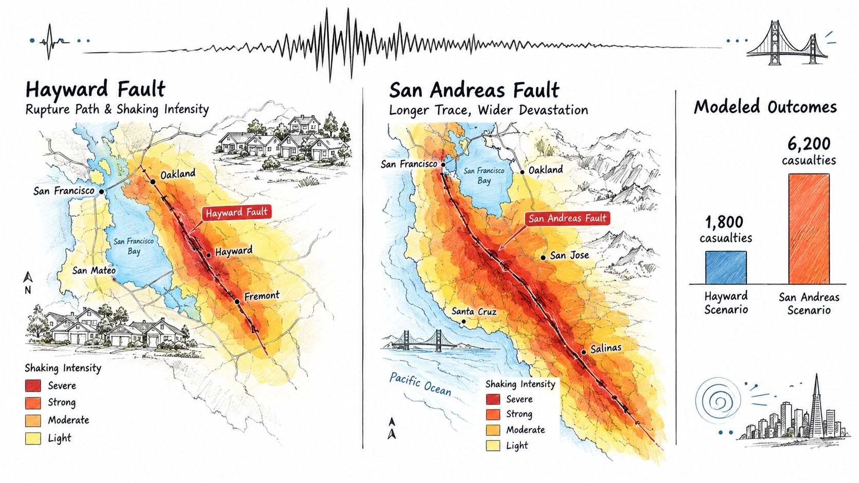
A buyer comparing Bay Area homes can get the wrong answer from a single “earthquake risk” label. Two faults can produce similar magnitude scenarios and still lead to very different damage patterns, because rupture geometry, shaking distribution, and the built environment shape the outcome. Bureau of Labor Statistics Bay Area earthquake analysis
 Hayward and San Andreas faults." loading="lazy" />
Same region, different scenarios
A magnitude 7.2 Hayward Fault earthquake in the San Francisco Bay Area was projected to cause at least moderate damage to 36.9% of establishments, while a similarly large San Andreas Fault scenario raised that share to 57.2%. Exposed employment reached 1.75 million jobs in the strongest shaking zones.
Those numbers show why fault-specific framing matters. A regional earthquake label hides the fact that two scenarios can create very different recovery paths for workers, businesses, and infrastructure, even inside the same metro area.
Scenario thinking belongs in relocation research
The right question is which fault scenario, which buildings, which critical systems, and which commute corridors are likely to be hit. That is the gap a single letter grade leaves open.
For buyers comparing California options, a screen such as safest cities in California helps narrow the field. The next question is which fault scenario dominates your target county, not whether the city label says safe. A city can look calmer on a map and still sit near a fragile substation, a steep slope, or older wood-frame stock.
A Practical Screening Framework for Homebuyers
A strong earthquake screen starts with a simple rule, compare places first, then compare parcels. A city can look acceptable on a broad index and still contain blocks, buildings, or slopes that sit in very different exposure categories. For a quick market scan, towns with lowest natural disaster risk can help narrow the field, but it should only be the first filter.
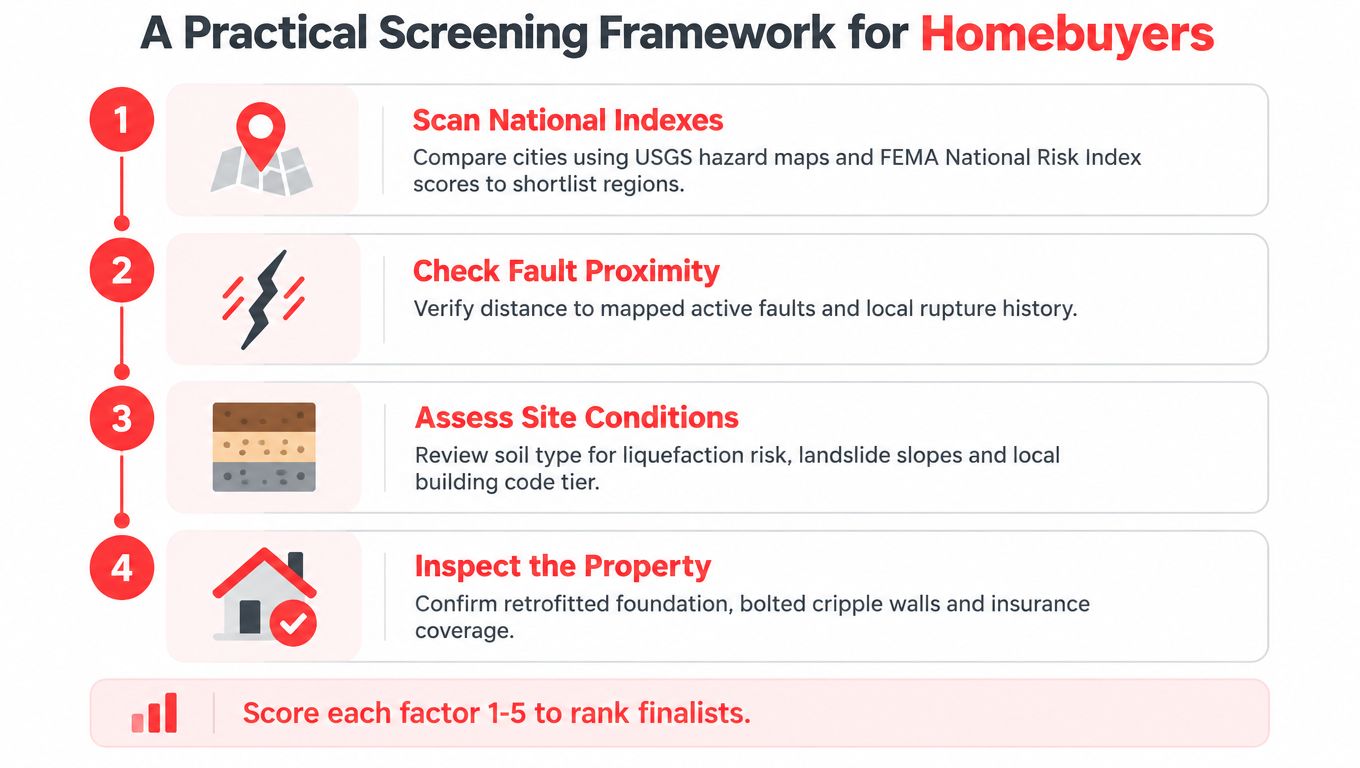
Start with city comparisons, not house hunting
Use the city-level screen to remove weak candidates, then look at the local tradeoffs inside the shortlist. The core question is which places deserve a deeper look because they combine shaking exposure with vulnerable building stock, difficult terrain, or fragile infrastructure.
Move from the map to the parcel
Once a city stays in play, check fault proximity, soil type, liquefaction risk, slope, building age, and retrofit status. Those details decide whether two homes in the same zip code belong in the same risk bucket. A single letter grade cannot show that difference.
Include insurance and recovery capacity
A property also needs to clear the practical test. Can the buyer get coverage on workable terms, and could the household absorb a disruption without a long recovery delay? For a parallel on how buyers are increasingly asked to read property-level risk, the Redfin climate risk report is a useful reference point.
Score the finalists consistently
Best practice: assign each factor a simple 1 to 5 score, then compare totals only after reviewing the parcel conditions.
Use the same scoring method for every finalist. That keeps the process from drifting toward whichever home looks safest on paper. If a target city is permitting heavily, rerun the screen after new construction cycles, because exposure can rise as the built environment expands, a point that aligns with the future-looking approach in GEM risk maps 2025.
Hidden Vulnerabilities and Equity Gaps
A low-loss location can still be a poor fit for a vulnerable household. The gap usually sits in tenure, income sensitivity, construction type, retrofit rate, and access to recovery resources, not in shaking intensity alone.
Puerto Rico shows why structure type matters
Puerto Rico is a clear case of why hazard-only comparisons can mislead. Its building stock includes a large share of unreinforced masonry, and FEMA, USGS, and NEHRP estimated average annual earthquake losses of $340 million, placing the territory among the highest-loss U.S. regions. GEM risk maps 2025
The point is simple. Physical hazard does not translate evenly into lived risk. A place can face familiar shaking and still carry a heavy loss burden when buildings are weak and residents have limited access to retrofit financing or post-event recovery.
Lower aggregate loss can still hide hardship
The same ZIP code can produce very different outcomes for two households. An owner-occupant who has already retrofitted may face repair costs and interruption, while a renter in an unreinforced unit can lose housing security altogether after the same event.
That contrast is why city-level loss figures need household-level context. A lower aggregate EAL can still be a bad fit for renters, older residents, or families with little savings, because they have less room to absorb displacement, insurance gaps, or delayed repairs.
A screening process should separate absolute loss from loss relative to local income and public capacity. It should also ask who would carry the disruption, since standard maps rarely show that burden clearly.
For buyers who want places with a stronger retreat-style profile, strategic retreat towns can sit inside a wider shortlist. The right test is whether the location combines manageable shaking, durable construction, and a recovery path that matches the household's budget and mobility.
Frequently Asked Questions
Is an earthquake disaster risk index the same thing as an earthquake hazard map?
No. A hazard map estimates likely shaking. A disaster risk index adds exposure, vulnerability, and expected loss, so it is better for comparing how much damage a place might face and who would feel it most.
What does 2% probability of exceedance in 50 years really mean?
It means the mapped shaking level has a 2% chance of being exceeded during a 50-year window. It is a ground-motion threshold for design and comparison, not a prediction that an earthquake will occur somewhere else in the country on that schedule.
Why can two homes on the same street have different earthquake risk?
The street address does not tell you the soil profile, foundation condition, retrofit history, slope, or building age. One parcel may sit on firmer ground in a newer structure, while the next lot faces soft-soil amplification or a weaker structural system. Pull the parcel's liquefaction zone before the offer if you want to spot that difference early.
What should I check before I trust a city's earthquake score?
Check fault proximity, soil type, liquefaction exposure, slope, building age, retrofit status, and insurance conditions. If those items are not verified at the parcel level, the city score is only a rough filter, not a buying decision.
Does a lower FEMA score always mean a safer place to live?
No. Lower expected annual loss can reflect fewer people or fewer assets in harm's way rather than stronger buildings or easier recovery. A rural county can post a low aggregate loss because exposure is thin, while a dense metro can show a higher loss even when building codes and retrofit activity reduce the chance of severe structural failure.
Should renters use the same screening process as buyers?
Yes, but the emphasis changes. Renters should focus more on building age, retrofit evidence, insurance access through the landlord, and whether the area can support a long disruption, since renters usually have less control over mitigation.
How does future growth change earthquake risk?
Growth can raise exposure even when the underlying hazard stays the same. As noted earlier, GEM-based seismic risk work has been used to push projections further into the future, which shows how a place can age into greater risk as density and asset value rise.
Enjoying the blog? Subscribe to ReloMaps+ for premium area intelligence — and to keep us independent.
Subscribe today